There is no doubt that Power BI is a powerful analytics tool. With non-technical users in mind, it allows anyone to plug in their data and get a 360o overview of their business in seconds. Through natural language querying, users can gain insight into KPIs and make data-backed decisions. Findings can then be seamlessly shared with colleagues, so everyone has access to the information they need.
Why use visualisations?
Nowadays, data is everywhere and it is estimated that only 5% of the 2.5 quintillion bytes produced each day is ever used. As businesses continue to churn out data at an unprecedented rate, Business Intelligence solutions like Power BI are key in harnessing that data and turning it into something useful. The brain processes images 60,000 times faster than text, so presenting data as graphics and visualisations makes it easy to pick out the most important information and make actionable insights quickly. These visuals save a lot of time and overhead and mean that anyone can be a data analyst. Suddenly, huge amounts of data can be presented in a simple format and everyone can get a clear view of what is going on within the business.
Types of visualisations
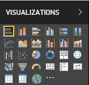
Microsoft offers over 20 different types of visualisation in Power BI dashboards and reports, as well as a huge library of custom-made visuals provided by Microsoft and the community. In this blog post, we will demonstrate some of the most popular visualisations available in Power BI to give some inspiration for how you might configure your own dashboards and reports to get the most from your data.
Area charts
An area chart is a line chart in which the area from the line to the x-axis has been shaded in to indicate volume. This type of chart is best for displaying and comparing trends over time, as well as highlighting total value. For example, an area chart could be used to compare sales from this year against those from last year, highlighting trends throughout the year as well as how the annual total compares.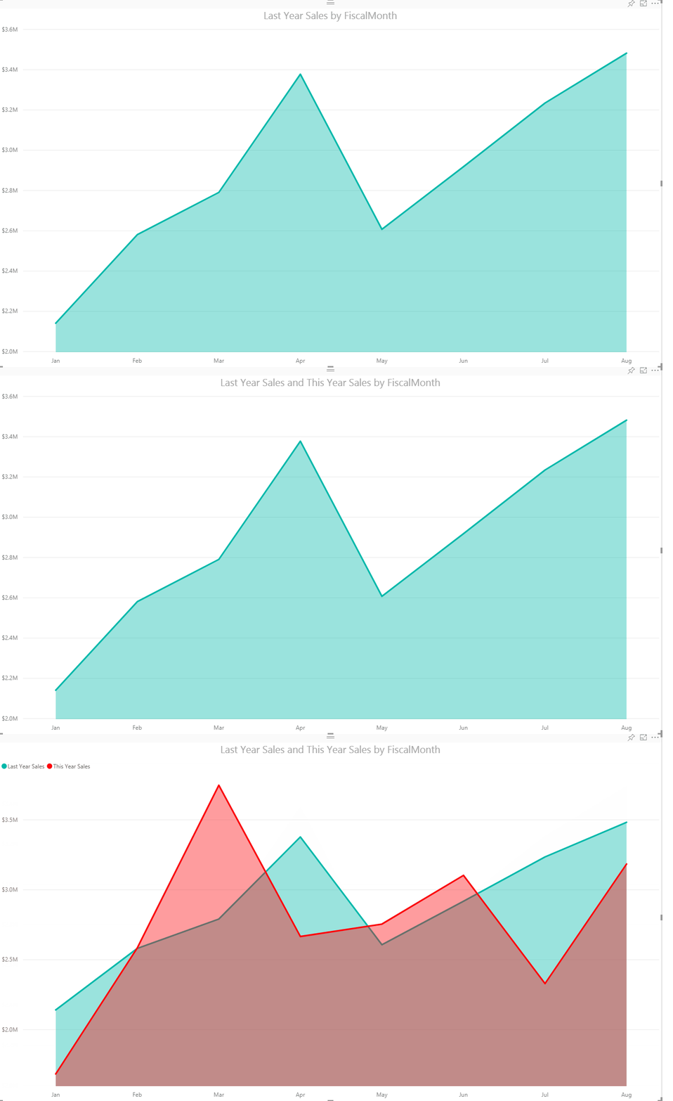
Combo charts
A combination chart merges column charts and line charts into one single visualisation with one or two Y-axes. Combining the two visualisations allows you to quickly compare data sets and easily draw insights. In our example, the visualisation shows this year’s sales and the gross margin in columns, with last year’s sales represented by the line overlaying them, allowing for easy comparison between the datasets.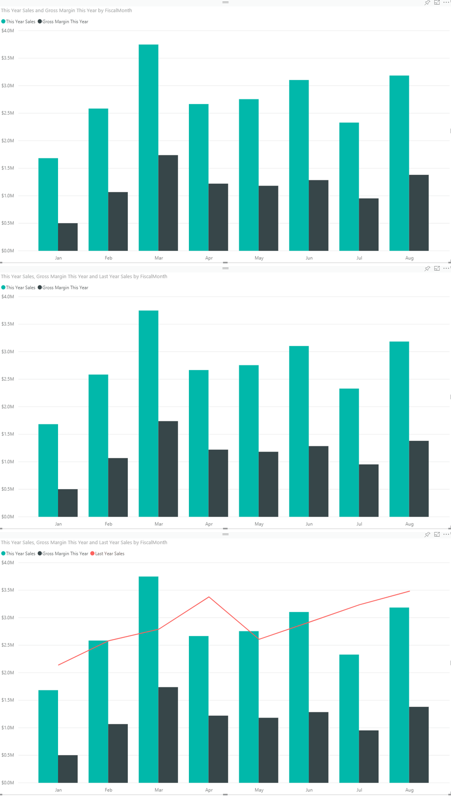
Cards
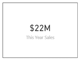
Sometimes you don’t have time to search through reports and dashboards for a single statistic. This is where card visualisations come in, allowing you to easily track and display up-to-date figures for single metrics. For example, these can be KPIs such as products sold or profit made. Multi-row cards are also available to display more complex information such as average unit price and total units this year.
Tree maps
Tree maps display data through sets of coloured rectangles with their sizes changing according to value. The largest rectangle is always set in the top left corner and the values decrease as you move down and right. Rectangles can be nested inside one another to show a hierarchy; the main rectangles are referred to as “branches” with the smaller ones nested inside known as “leaves”. Our example shows units sold by product as branches and the rate of sale in various countries as leaves. This gives quick insight into which products are performing best across the globe.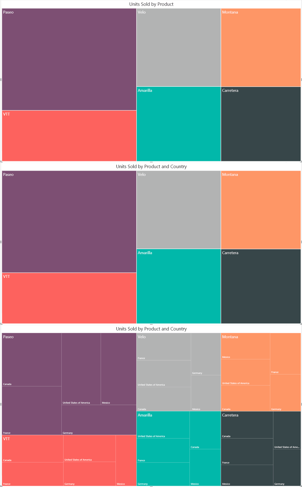
Doughnut charts
Doughnut charts are much like pie charts in the way they display categories as a proportion of a whole, but doughnut charts have a hole in the middle for a label or icon. Doughnut charts are useful for making comparisons between categories and groups. In our example, the doughnut chart breaks down last year’s sales by category, giving a better understanding of which product categories performed best.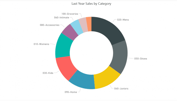
Funnel charts
Funnel charts represent stages of a linear process and the flow of items through that process. Having a visualisation of the process allows you to assess its health and identify potential bottlenecks. A great example of a funnel chart is a visualisation of a sales funnel tracking customers through their buying journey.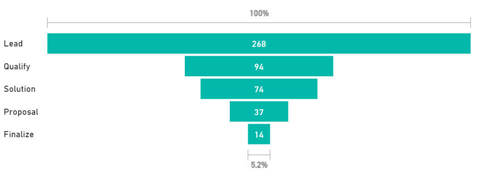
Gauge charts
Gauge charts are useful for visualising progress towards a goal and are particularly handy for tracking KPIs. By tracking progress with a gauge chart, you can quickly understand how close you are to hitting your target and whether or not you are on track to do so. In a gauge chart, the goal is shown by a grey needle and progress is represented by the shading of the gauge. In our example, the total number of sales so far this year is represented by blue shading, with the needle showing a minimum target of last year’s sales total.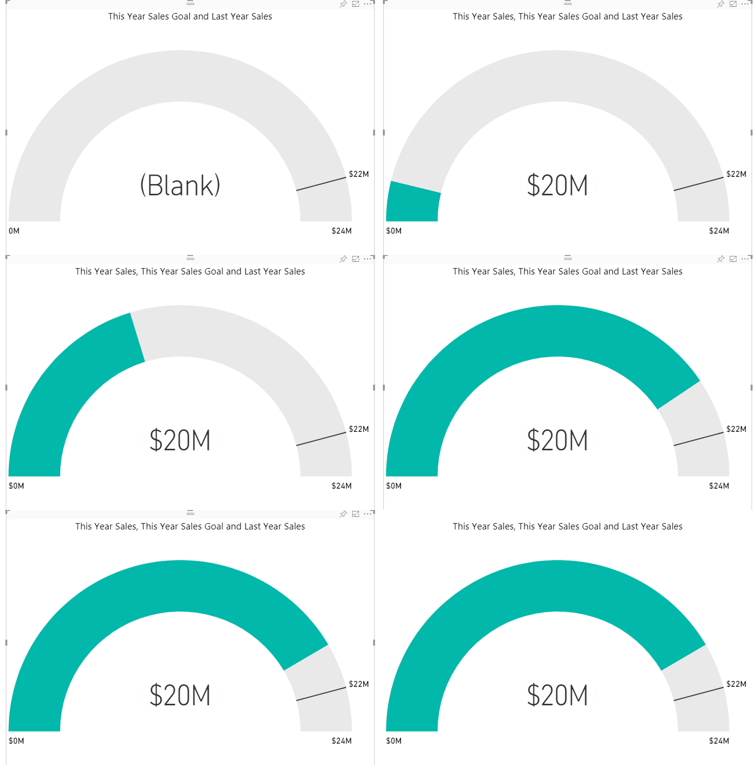
KPIs
KPI visuals also show progress towards a measurable goal. In our example, the graphic shows this year’s sales by month alongside the this year’s sales goal by month. We can quickly see that the business is 8.56% away from achieving their goal.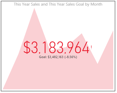
Bubble charts
Bubble charts are great for depicting data with numerical values along both the horizontal (x) and vertical (y) axes. The chart displays bubbles at the intersection of the x and y values, as well as showing value through the size of the bubble. Bubble charts are useful when looking for patterns in large data sets, as the distribution and placement of bubbles make it easy to pick out trends and anomalies in data. In our example, the scatter graph shows sales per ft² and the sales variance. As this year’s sales are added, the bubbles grow according to their value, adding a third dimension to the visualisation, allowing patterns and outliers in the data to be recognised more easily. Bubble charts are often used to visualise financial data and quadrants.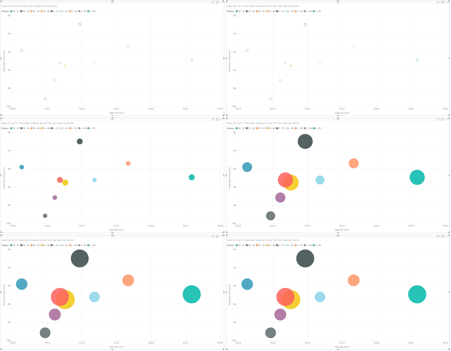
Ribbon charts
Ribbon charts are similar to stacked column charts, in that the categories in each column are sorted according to their value. However, in a ribbon chart, the largest value is at the top, with ribbons connecting each column together. They allow you to instantly determine the highest values between categories and identify trends over time. For example, when examining the number of units sold over a year, a ribbon chart can easily show you which products are selling best at different times of year as well as how the demand for specific products changes over the course of the year.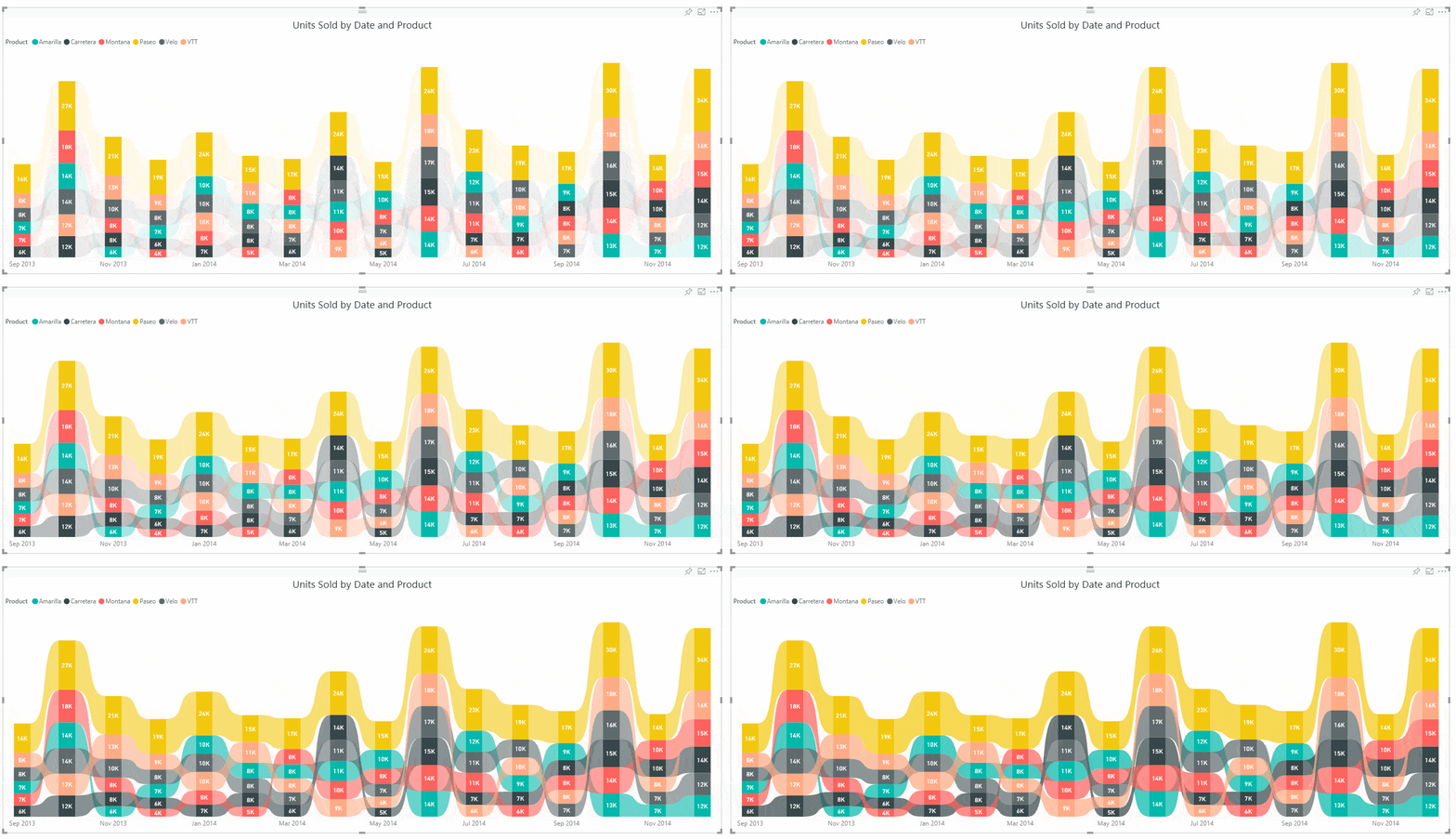
Waterfall charts
Waterfall charts show changes in an initial value over time. They are particularly useful when tracking how a value is affected by positive and negative changes. Our example shows the total sales variance by month with increases in green and decreases in red. The blue column to the right shows the end total.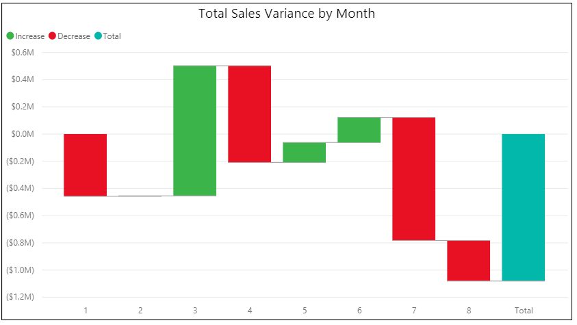
Map charts
As Power BI is a Microsoft solution, it has full integration with Bing Maps to produce map charts which are perfect for displaying both categorical and quantitative data that is relevant to physical locations. For example, you could analyse this year’s sales by region to get a better understanding of which stores are most successful. Bubble maps can also break down data by category to show multiple results for the same location. Power BI also features filled maps (choropleths) and ArcGIS maps to display geographical data in different ways. Filled maps use shading to display different values across a map, with light shading representing a lower value and dark shading a higher one. ArcGIS maps take map charts to the next level, with additional settings including heat maps and data aggregation. Our example shows sales by postcode and store type, with the new stores in blue and older ones in black. When you hover over each bubble, Power BI displays the postcode, store type and sales for this year, giving a deeper insight into which stores and regions are performing best.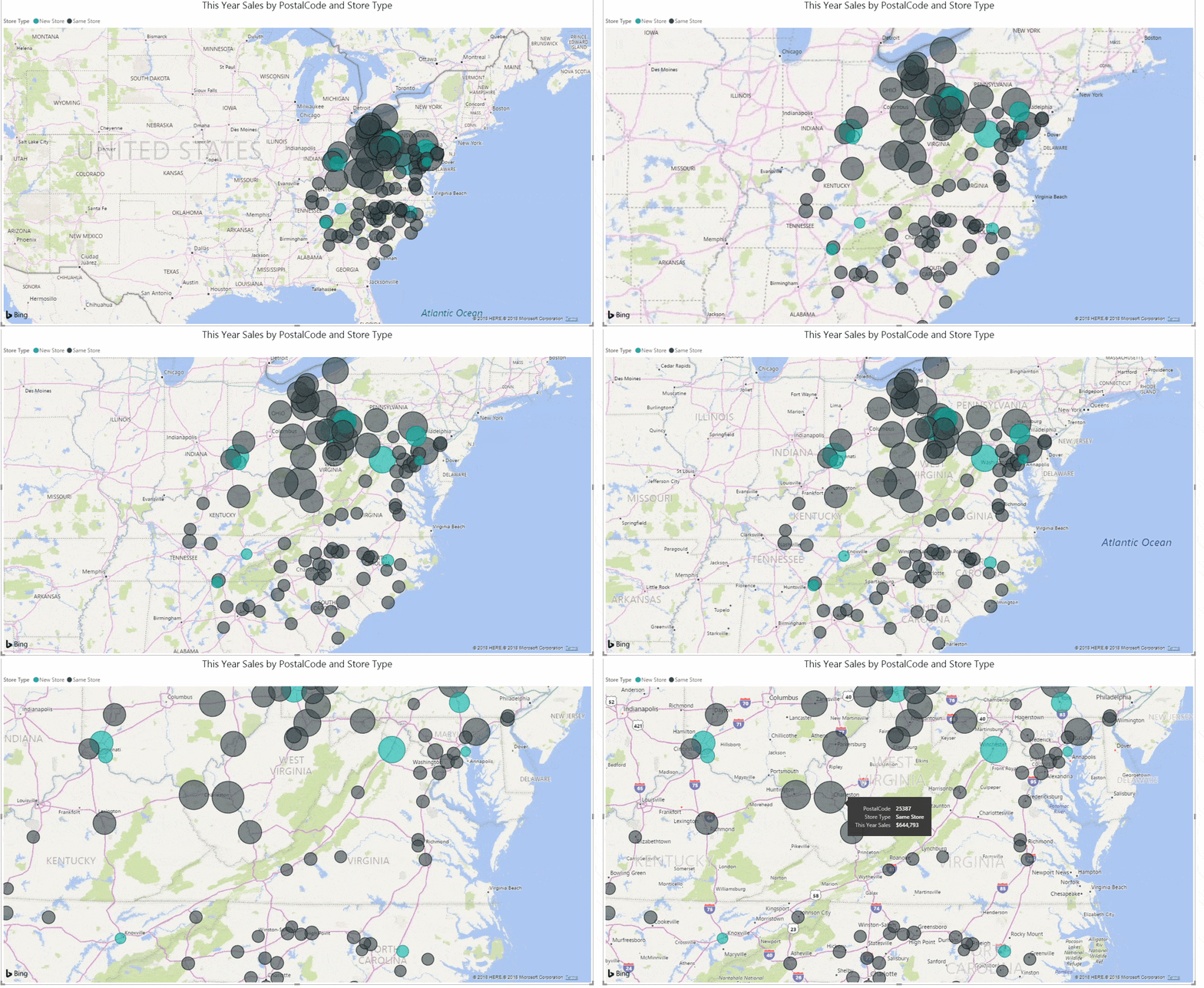
Tips and tricks for Power BI data visualisations
Slicers
Slicers enable users to interact with visualisations through filtering. You can segment data by any value across a data set, dashboard or report to explore the data in more depth, rather than creating a separate visualisation each time. Slicers can be synchronized across multiple report pages, to filter all your visualisations with one click. In our example, the slicer is set to show each district manager alongside their performance. Once the slicer is selected, the other visualisations also update.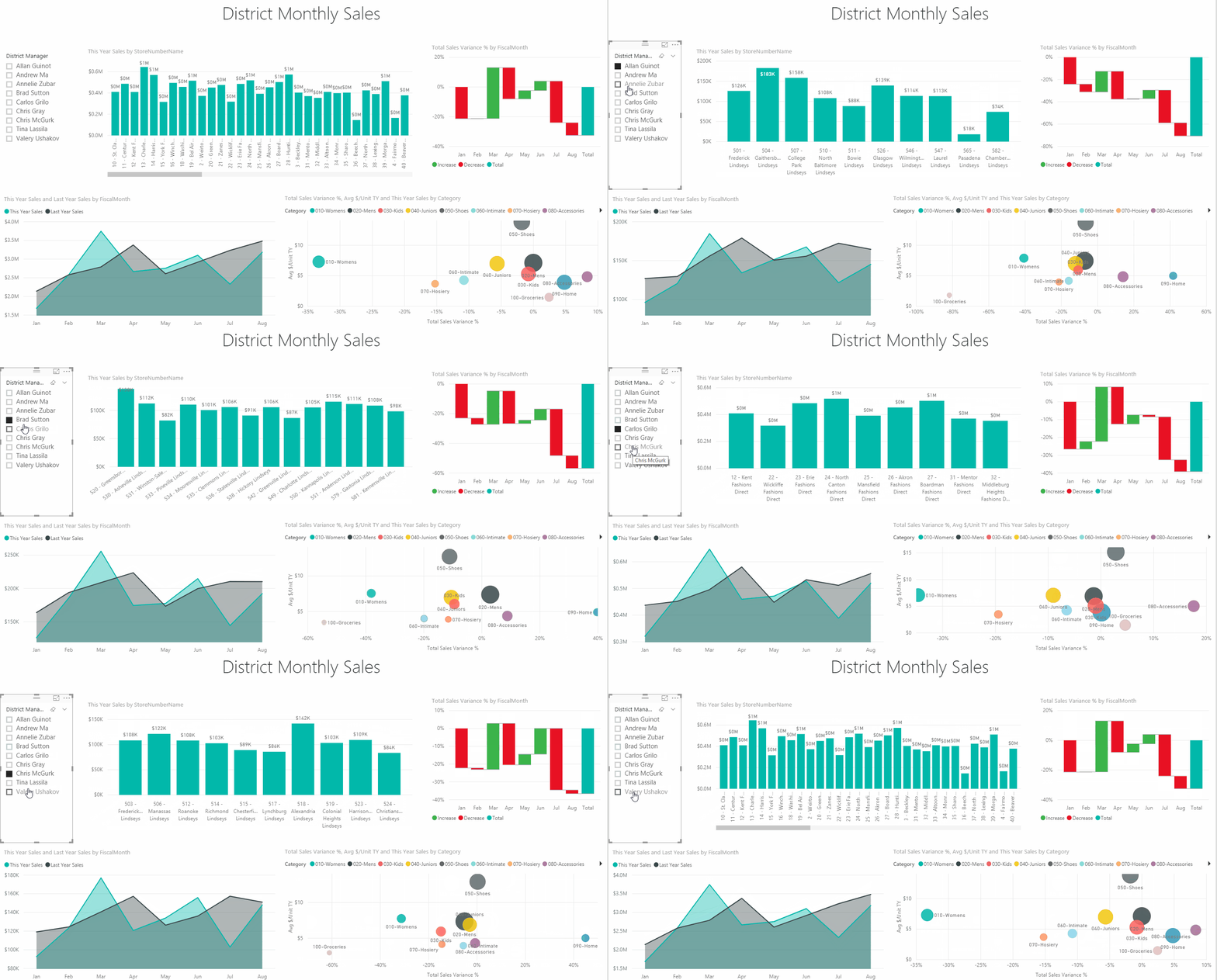
Customisations
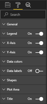
There are a number of options available in Power BI for customising visualisations, all within the formatting tab (the paint roller icon) inside the “Visualizations” pane. Visualisations with different visual elements may come with different formatting options. For example, when formatting doughnut charts and tree maps, you can’t edit the axes as there aren’t any. Some of the main formatting options available for most visuals are:
- Legend – Position, title, legend name, text size, font type, font colour
- X and Y axes – Turn on or off, change colour, text size, font type, text, style, positioning, padding
- Data colours – Change individual colours for each dataset
- Data labels – Colour, units, decimal places, orientation, position, overflow text, text size, font type, background
- Shapes – Stroke, join type, style, shading
- Title – Turn title on and off, change title text, font type, font colour, background colour, text size, alignment
- Background – Colour, transparency
Q&A
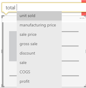
Another great feature for exploring your visualisations in Power BI is the built-in Q&A function, which allows you to ask questions about your data in natural language. Power BI then interprets the question and updates your visualisations to provide an answer. This enables anyone to perform tasks previously reserved for a data analyst. The function can be accessed from the top toolbar in the “Ask a question” tab. When you start typing a question in the box, AI suggests potential questions. In our example, Power BI gives suggestions for questions about totals.
And more…
This blog post gave an overview of just some of the visualisations available in Power BI. There are many, many more available on the platform and also as extensions from Microsoft AppSource. We hope this has given some insight into how and when to use each of the visualisations as well as some tips on customising and exploring your data. To learn more about Power BI and explore the solution for yourself, get started for free or contact us.

